Overview
An institutional-grade identity and site for an Ottawa advisory firm that stays with business owners across the whole arc of buying, structuring and growing a company.
Rootline Advisory & Partners helps business owners buy the right business, build it on solid ground, and grow it with clarity — acquisition advisory, business structuring and design, and growth advisory under one roof. Their thesis is a market observation: Canada is entering the largest business ownership transition in its history, most owners are not ready to sell, and most first-time buyers are underserved by an industry built around institutional deal flow. The firm works with the people that industry overlooks, women and first-time buyers in particular. The site had to make a young firm read as the serious, senior option in the room from the first scroll.
Advisory is sold on trust before it is sold on service, and Rootline was asking prospects to hand over the biggest financial decision of their lives. The firm had no transaction history to display, no recognisable logos, and a service mix that is genuinely hard to explain — three distinct offerings that most competitors sell as separate engagements from separate vendors. The positioning depended on a subtle argument: that continuity across all three is the product. Nothing about that lands on its own. It needed a structure that names the market problem first, then presents the three services as one path rather than a menu, and a visual language that signals institutional weight without the stock-photo blandness the category defaults to.
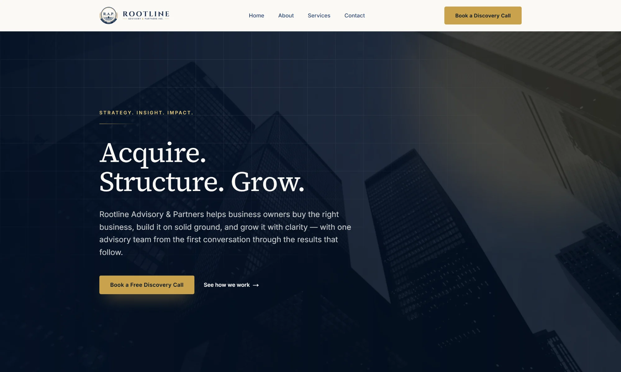
We built a static Next.js site on Vercel, prerendered so every page is fast and indexable. The narrative is sequenced as an argument rather than a brochure: the hero states the promise in three words — Acquire. Structure. Grow. — then the page names the market problem, presents the three services as numbered steps in one journey, and closes on the differentiator that ties it together. Each service gets its own detail page for search intent. The identity does the credibility work: deep navy against warm sand, a single gold accent reserved for actions, and Source Serif 4 for display set against Inter for body — a pairing that reads closer to a law firm or a merchant bank than a consultancy template. Every call to action funnels to the same low-friction ask, a free 30-minute discovery call, which is the right commitment level for a decision this size.
The Results
0.32s
Page Load
48KB
Page Weight